My queues are currently closed. I'm sad too, but yes, this means I am not taking new customers at this time. If you're interested in my work please feel free to subscribe.

Jul 15, 2018

Updates for a Past Client

It's so amazing that after 10 years Stephanie still loves her design!  She just wanted her blog a bit wider and I did a few other tweaks while I was there.  Take a look.


I still work with past clients every now and again and it is always a pleasure to do a little blog work on occasion.

Thanks for looking and have a great day!

Jul 20, 2015

Portfolio Update

If you are one of my followers you know that I have not been doing much graphic or website designing for a while.  I do still do the occasional job for previous clients and I have done a little work for some friends here and there as well.  This is post is just to complete my portfolio to this point.  These designs were completed over the past couple of years.

If you are new to my designs be sure to click through to the sites I designed. There is so much more on the teh actual sites, I am very detail oriented and I want you to see the footers, sidebars plus all the other little details I add to each design.

First on the list are a couple of graphics for Libby's Tour de Craft event she hosts yearly during Tour de France.  I provided her with blanks too so she can reuse this each year, well until she decides she was to shake it up anyway.

http://stampinlibby.blogspot.com/

Secondly is Jodi Collins! This is one of my very favorite designs. I had so much fun working with these bold colors, I even put filters on her beautiful photo to blend her with the blog design. All of the graphics are my original art so that adds to my love for this deign as well. Jodi is such a sweetheart, go give her a little click.

Here is a redesign I did for one of my oldest clients, Melissa. I think she was the 4th blog design I ever did. She was very patient with me back then! Melissa even went to another designer (because my line was WAY TOO LOOOONG) and then came back for some tweaks and then a another full redesign after that. I think she likes working with me, I know I love working with her! This design also has other website headers that Melissa changes out each season and on holidays so go check her out every now and again to see all the cuteness.

This was a MASSIVE project. It is an entire social network, kind of like facebook but for electronic dance lovers. I used Social Engine and a plethora of plugins to fulfill my old friends many, many requests. It is now being managed by someone else so it is a little different looking now, a bit less refined but I think they are still working on getting it all back up and running. It went offline for a bit due to issues that have nothing to do with me or the design. :)

Next up is BRE Couture, another old friend of mine named Brandi who got together with some of her girlfriends to make and sell totally ADORABLE kids clothing. I made MANY graphics for her, this is just a sampling. They needed mostly facebook graphics and page designs, Etsy graphics, Business Cards and Tags for the clothing they sell in a brick and mortar store.

Jody was amazing to work with! She is a truly inspirational crafter who has talent oozing from every ounce of her existence. I did a full blog design and a store design to match for her.

Karen at Your Next Stamp had her store completely redesigned by someone else. Again, I was just too busy and trying to scale back on the design. But she still needed her blog to match the store and many fun little graphics to match. Take a look all around the blog to see all the little sprinkles of fun I added.

I previously designed Julie's blog years ago and she wanted a fresh new look. This is a full redesign and she loves it, how about you?

This is another one I helped Julie complete. She provided pre-made graphics and I put it together and got it all coded up for her. She is always dream to work with! By the way, her adoption is completed and it was SO MUCH fun watching it all happen! LOVE that lady!

Here is a less cutesy site I did for Next Truck Sales.

I originally worked with Julie Campbell years ago, another early design. Well she was finally ready for a new look and had gotten it all together and even did the full page layout. All I really did on this for was the coding and graphic matching. I think it turned out great, she is a very talented lady!

Another return customer, Sue Kust at The Spirit Zone. I did her original blog design to match her store years ago. Here she just wanted it to be a little bit cleaner and this is what we came up with.

Well, I think that covers all the designs I have never posted. There may be a few I missed and if I run across them I will make another post. I have lots of different styles here, I like to be diverse as I know not everyone loves the same look and feel. My favorite part of custom designing is widening my horizons and working with the client to make the website exactly what THEY WANT and LOVE!

Thanks for visiting and have a wonderful day!

Aug 6, 2013

My Time Made Easy made it to the NEXT ROUND of Walmart Voting!!!

I am SUPER EXCITED to announce that Lauren Meader; client/boss, my dear friend, and owner of My Time Made Easy™ LLC made it to the next round of voting! Help get MTME products on the shelves of Walmart!!!! Vote for her using the below link!!! You can vote DAILY until September 1st. Share the link and PLEASE VOTE!

CLICK THIS LINK OR THE IMAGE BELOW TO VOTE!!!

Jul 31, 2013

Help My Time Made Easy Get into Walmart!!!

Lauren Meader; client/boss, my dear friend, and owner of My Time Made Easy™ LLC was contacted the other day and received an amazing opportunity to be considered by Walmart to have my products sold at Walmart.com & possibly in Walmart stores. MTME is undergoing review, and if we make it to the next round we will let you know on the MTME Blog!

*Walmart is interested in hearing YOUR feedback*


Please watch the video, share it, like it, and if you have used our products and have anything to share, or a project to show,

PLEASE leave a comment on our YouTube page!!!

Click the picture above or the link below to view the video on YouTube:
http://www.youtube.com/watch?v=XVyVwt9FVtg&feature=youtu.be

Click here to read more from Lauren herself.

Mar 31, 2013

Changing Digital Paper Color Using a New Layer

My friend and one of My Time Made Easy's seasoned design team members, Tangii Crain, wanted to know how she could change the color of a more difficult to work with piece of digital paper we have in the store. Because of the great detail in the pattern it is a bit of a task to use traditional tools to get a nice clean color change. So I showed her a little trick which I have decided to share with all of you as well! Yet another reason why digital paper is so great to work with. If you don't like the color then, guess what, you can change it without having to hunt and/or buy another sheet! If you'd like to see the result Tangii please click this link to view it on her blog!

In this tutorial I will be using GIMP 2.8. Why? Because it's FREE!!! I know that older versions of GIMP will also have all the options I use here as well as Adobe Photoshop CSx Extended and even the cheaper Adobe Photoshop Elements. In other programs the steps may be a little different but with this knowledge you may be able to figure it out on your own. I know that GIMP and Photoshop are laid out very similarly. If you are wondering if your current graphics program will do this look to see if you have the option to add layers and if the layers have different blending modes as I discuss below. If you need help please comment here or on this blog post at the My Time Made Easy blog and I will look into it personally.

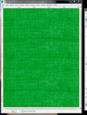
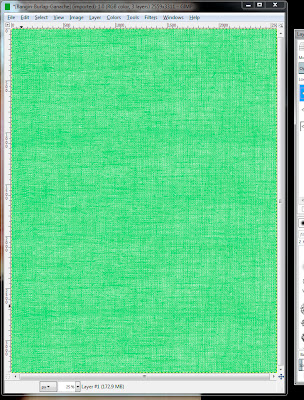
In this tutorial I will be using the Bangin' Burlap Acorn Squash and Bangin' Burlap Ganache from the Gardening Greats Acorn Ganache © digital paper set. The darker paper will give a bit of a darker result than the lighter paper, therefore I will be showing you the result of both.

This a a very QUICK 6 step procedure so get ready for the EASY! Don't let the legnth of the blog post intimidate you. It's only long as I have provided screenshots of each step. :D

  1. Open GIMP and then open up your paper in GIMP. To open the paper click File and then Open. You will see a dialog box. There you need to select the location of the paper, the paper file and then click Open. I have mine in a folder on my desktop as you can see below:

  2. Select the color you want to use on the palette foreground by double-clicking the foreground color on the Toolbox (in my example it is the green block).  Click the gradient square as well as that gradient rectangle to get the desired color:

  3. Click Layer and then New Layer on the top menu:

  4. Choose Foreground Color under Layer Fill Type:

  5. Change the Mode for the layer to Color (make sure your new color layer is selected, if you do nothing between step 4 and 5 it will be selected already):

  6. You can print directly from GIMP or you can save it as a JPEG so you have your re-colored paper to use forever for printing at anytime you choose:
    1. To print click File from the top menu and then click Print. A dialog box will appear. Here select YOUR printer, if it is not already selected, and then click the Print button:

    2. To save a JPEG in GIMP you must use the export feature. To do this click File from the top menu and then Export. You will see a dialog box, type your new file name, select JPEG from the List and then Export. Another dialog will appear, the default setting should be fine so just click Export:

Below is the color overlay on the lighter and darker colored papers to show you the difference. Also feel free to use different Modes from step 5 for different results:


I hope this comes in handy for you! If you have any question please comment here or on this My Time Made Easy blog post.

Have a wonderful day!